Overview

Authcore.io is a startup that focuses on cybersecurity related projects. We work closely with our clients to meet their security needs. ​

2018 - 2020

My role

Product Designer@Authcore.io

Background

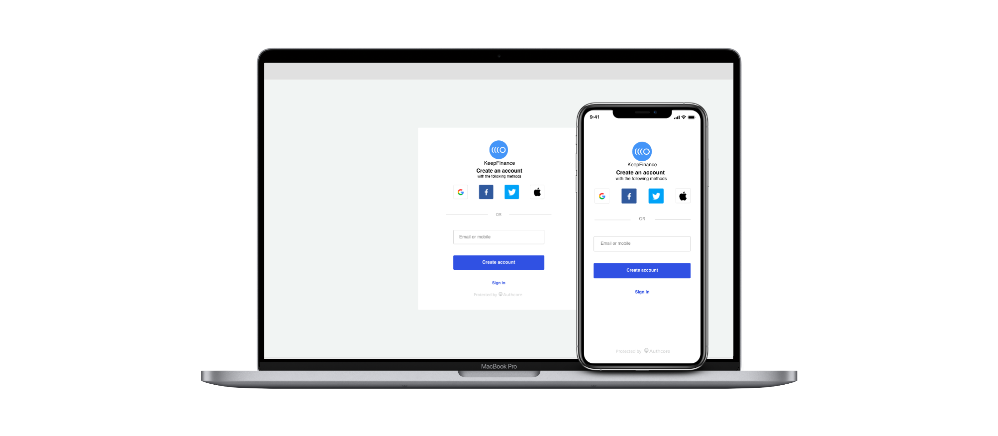
Authcore Sign in widget.

  • Our clients mentioned one thing in common is that the current authentication widgets in the market are not fulfilling their needs.
  • They are hoping that there could be better product to help them improving the sign in success rate and better user experience.
  • We wanted to explore the possibilities of turn this ideal product for a couple of clients to a product that’s scalable for more clients.

Research

User interviews

We interviewed a group of users to understand their behavioural pattern and preferences when they are trying to sign in to an account.

  • Biometrics is the best because they don't need to think and it feels secure. Most users learned about their account security knowledge from their workplace or bank accounts. Security key is new to me - most users haven't heard or seen a USB security key
  • Social login is for casual accounts and email is for accounts which have sensitive data (i.e. credit card info).
  • Troublesome to disconnect social login because some accounts doesn't support them to disconnect from social login Try to create a password to meet the rule but often forget that password afterwards.

Competitors product analysis

We studied a lot of sign in widgets in the market, we identified the following patterns and design opportunities
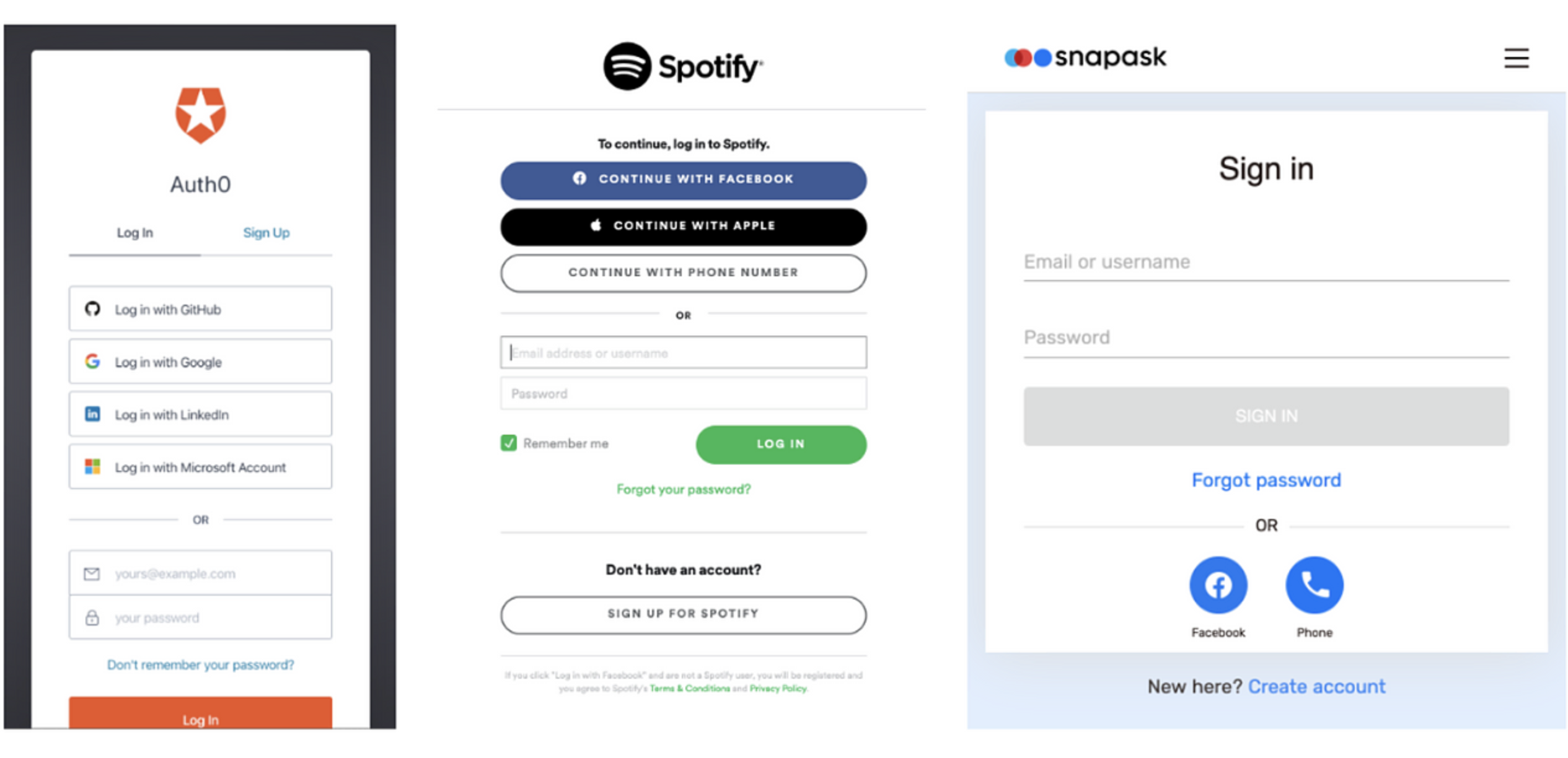
Key patterns

  • Sign in and create account are separated in two sections
  • Emails and mobile requires password and often users forget about their passwords

Design opportunities

  • What if the user don't need to define whether they are trying to sign in or create account?
  • What if the users can sign in or create account without password?

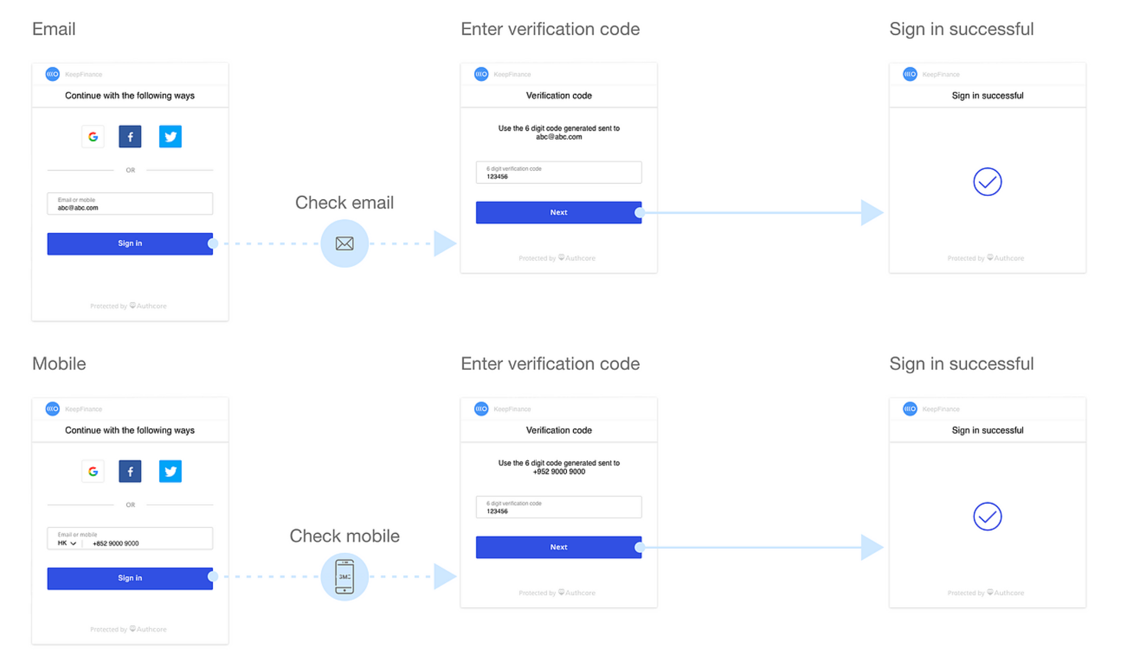
Sign in flow pattern

  1. Usually there are two paths Social sign in path and Password sign in path.
  2. If the platform has 2-step verification, the platform will request for 2-step verification at this stage. Common 2-step verification authenticators include security key, Authenticator app, Backup code or SMS code.
  3. Sign in successful. If the information provided by the user is correct.

Design opportunities

  • What if we can replace password?
  • What if we can simplify the password and 2-step verification (2FA) flow?
  • Furthermore, what if we can support cross-platform (Desktop web, mobile web, App)?

Industry standard

According to FIDO2 alliance https://fidoalliance.org/what-is-fido/ Password issue

  • 1/3 of online purchases abandoned due to forgotten passwords
  • 51% passwords are reused

Approach

How might we identify and give account access to the users fast and securely?

  • Don't make the user think or worried - Keep the sign in journey fast and secure
  • Go passwordless - Passwords are troublesome for users to remember and not secure
  • Support cross-platforms - Desktop web, mobile web and apps
  • Feel smart - minimise the number of choices in the sign in journey. Authcore should be able to identify whether the user is trying to sign in or create account because that data already existed in the database.

Idea

Authcore widget 1.0

  • Combine sign and create account - User don't need to decide whether they are trying to sign in or create account. The system can identify whether it's a registered account or not.
  • Go passwordless - Go to email or SMS to get the verification code. This flow can verify the account and the user don't need to memorise passwords.

Sigh in and create account

Input field design

  • Email or mobile - Some clients have email or mobile as the UserID. The input field we design can identify the difference between email and mobile. If the users need to change the area code that's available in the dropdown menu. The video below is record from the client's website.

Authcore widget 1.5

UI/ UX further development

  • Client and user feedback
    The social media part is and the email is overwhelming.What if the social media list is less overwhelming and only present the most popular options to the users?

We took decide to a step further to hide the unnecessary information and make the sign in widget less overwhelming.

Happy path Adobe XD prototype