Department of one working in Authcore. A startup building the authentication as a service, AaaS products from scratch.
2018 - 2020
Product Designer@Authcore.io, I was responsible in designing the brand experience which includes the brand's visual identity and the product experience.
After interviewing the key stakeholders, talking to different users to understand the key challenges they faced while using authentication products and completing the competitive analysis. We have identified the following 3 words as our key brand value.
Smart owl guard to look after your accounts.

The Authcore color palette uses friendly colours. Colors which are too bright and/or pastel colour will be less suitable.
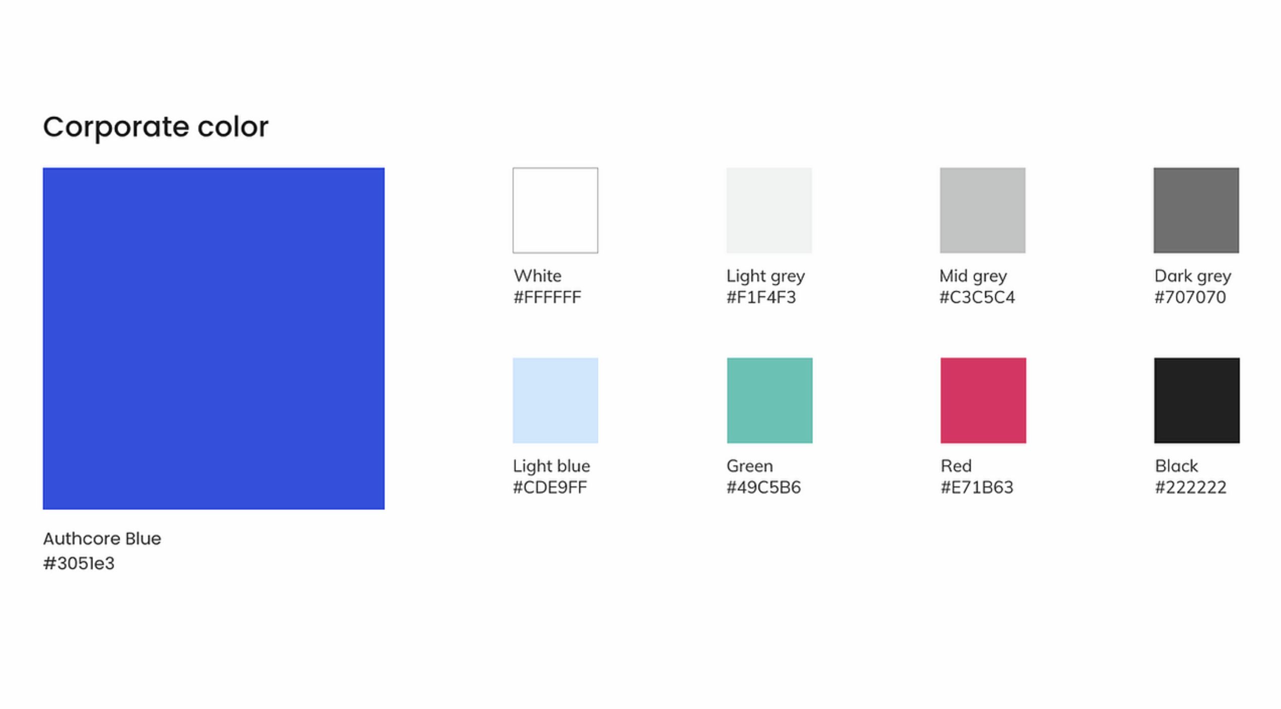
Authcore blue and white logo should be used in most scenarios.
Alternative color such as white, black, read and green could be used depending on the scenarios.

Poppins is the corporate fonts; regular, medium and bold could be used accordingly.

Mix and match Applying the brand colors and editing some of the icons from (https://www.flaticon.com/authors/inipagistudio) to fit the brand image.

To make sure that the product experience is consistent and coherent across the product ecosystem (AuthcorePass, Authcore Widget, User portal and admin panel).

The Authcore product ecosystem consists of 4 main parts:
AuthcorePass app, Authcore Widget, User portal and Admin panel.